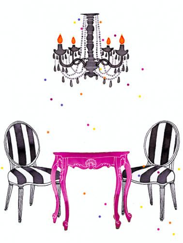
When I started In Good Company back in 2009, we had quite the bold and bright colour scheme predominantly black and white with fuchsia pink.
It then changed in 2011 to more muted pastels…
With the introduction of the Cape Town and Swiss shops in 2013 and 2014 we did all neutrals, still with the black and a pop of sunny yellow!

And lastly, we went back to bright colours in 2015/2016 but more jewel coloured tones.
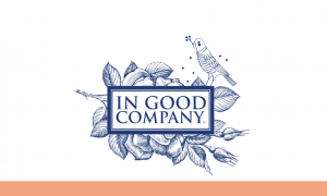
Now after a 4 year break, our new colour scheme has noticeable difference after all these years. All the black has been replaced by classic blue, and the logo has our little bird incorporated with some florals in the background.
And whilst the colours may change by season or year, the blue will remain; and these supplemenatry colours this season.